

Beth Alpert is a counsellor and consultant working across multiple areas of practice, with distinct client groups and services. The brief was to create a clear, professional digital presence that could accommodate this complexity without feeling overwhelming, while supporting trust, accessibility, and ease of use.
The focus was on helping visitors quickly understand Beth’s work, recognise which service was right for them, and move confidently towards making contact or booking.

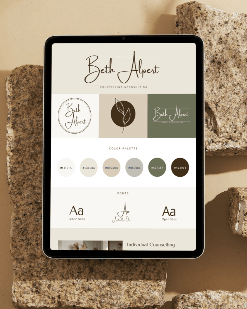
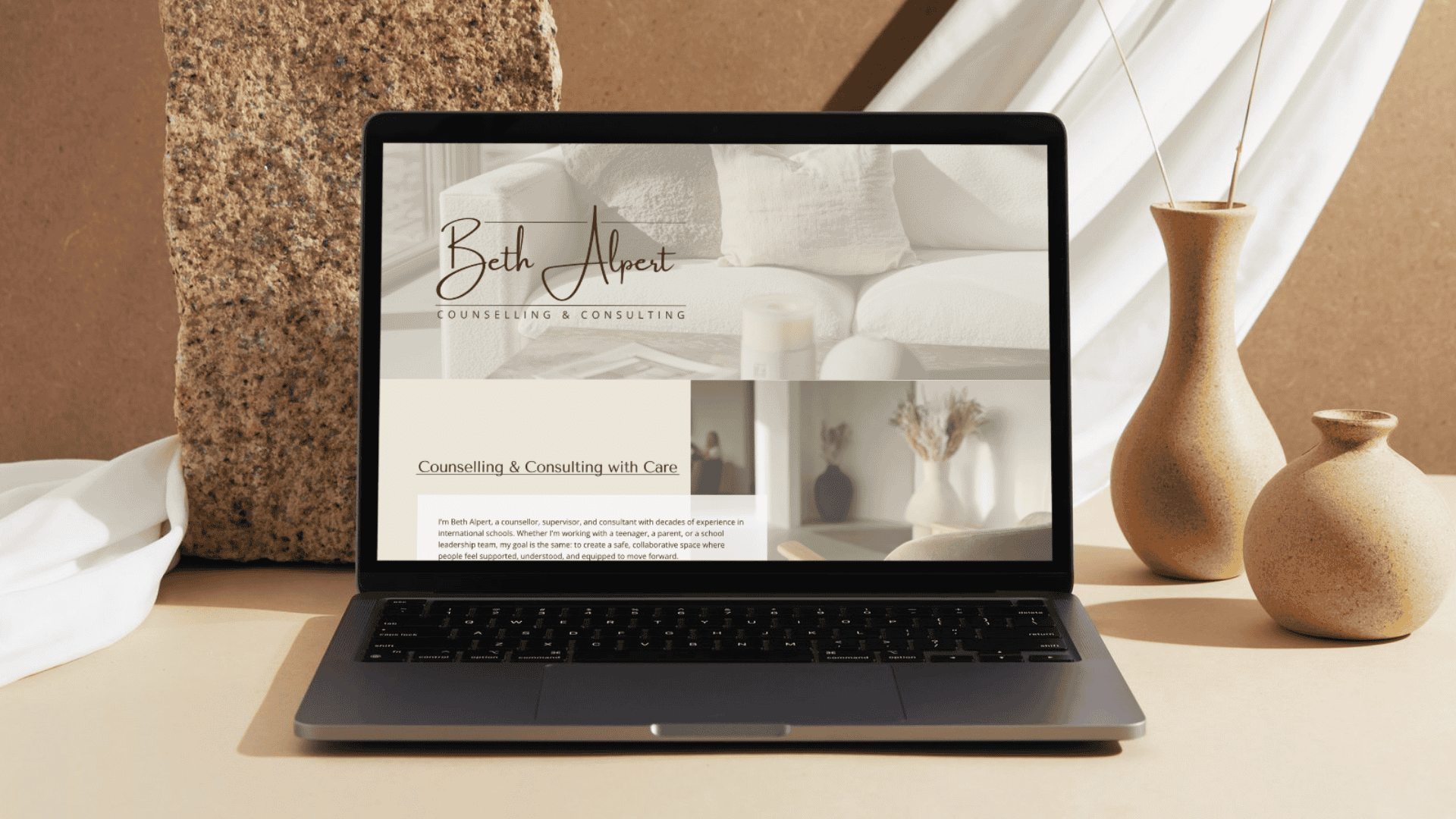
The project began with brand foundations, including colour palette, typography, and a wordmark logo, to establish a calm and credible visual identity.
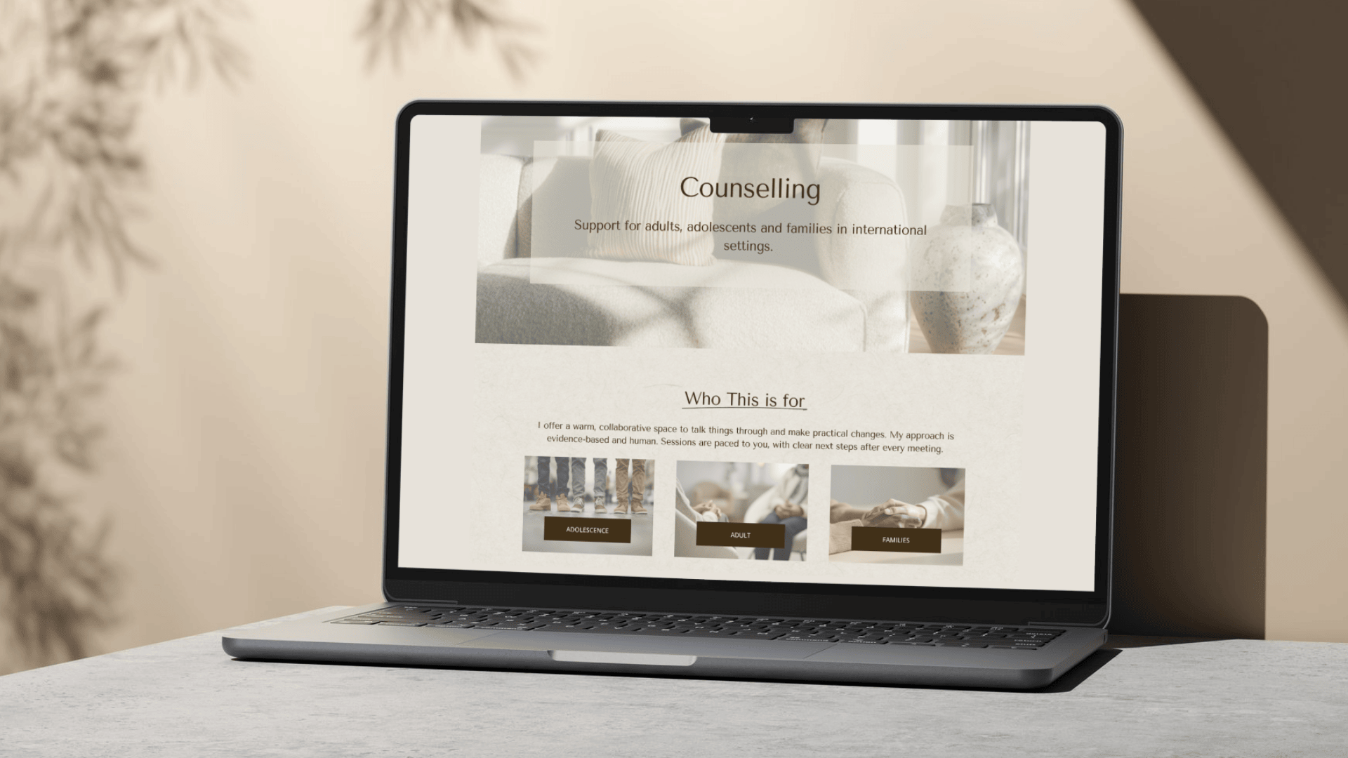
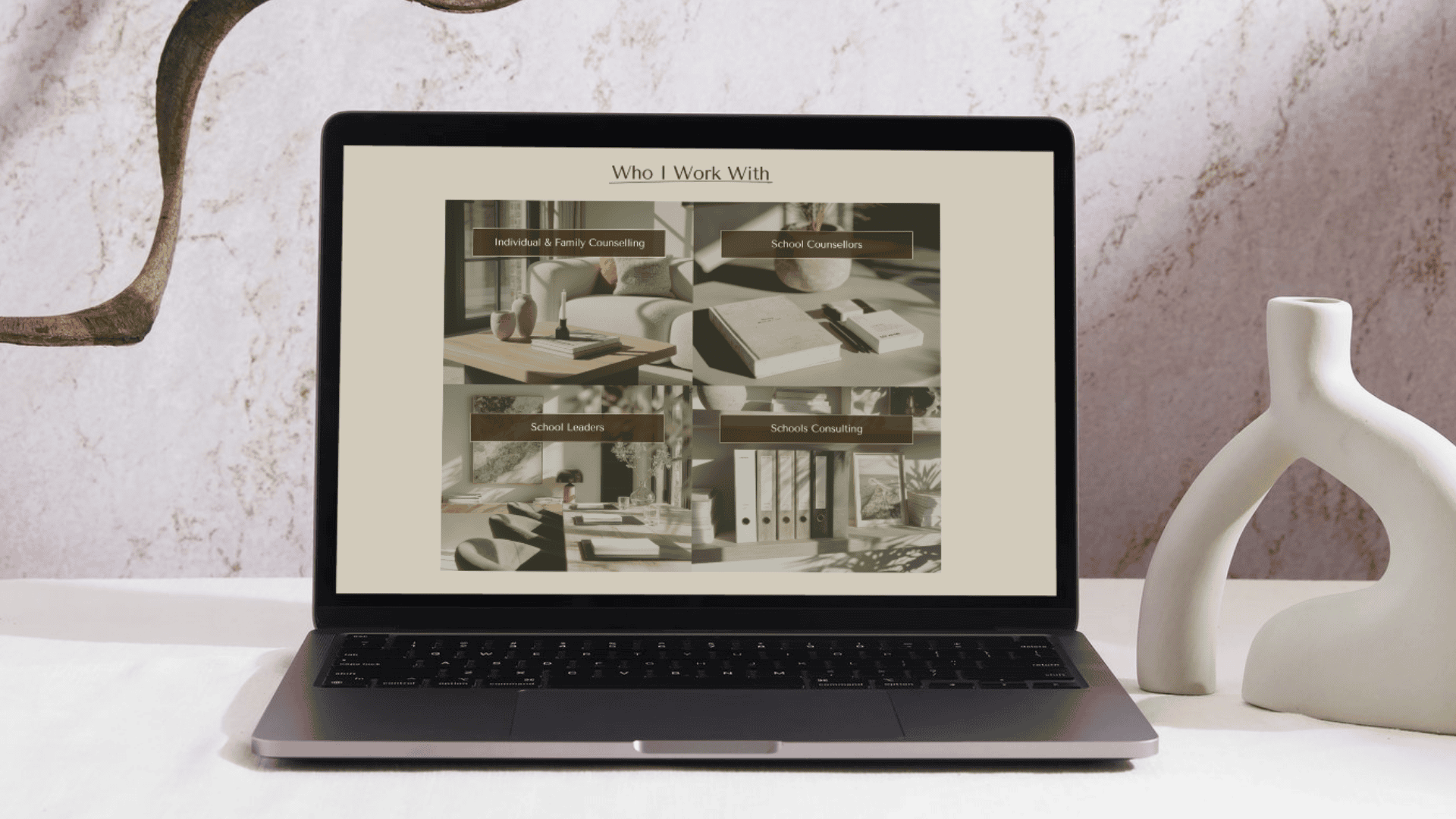
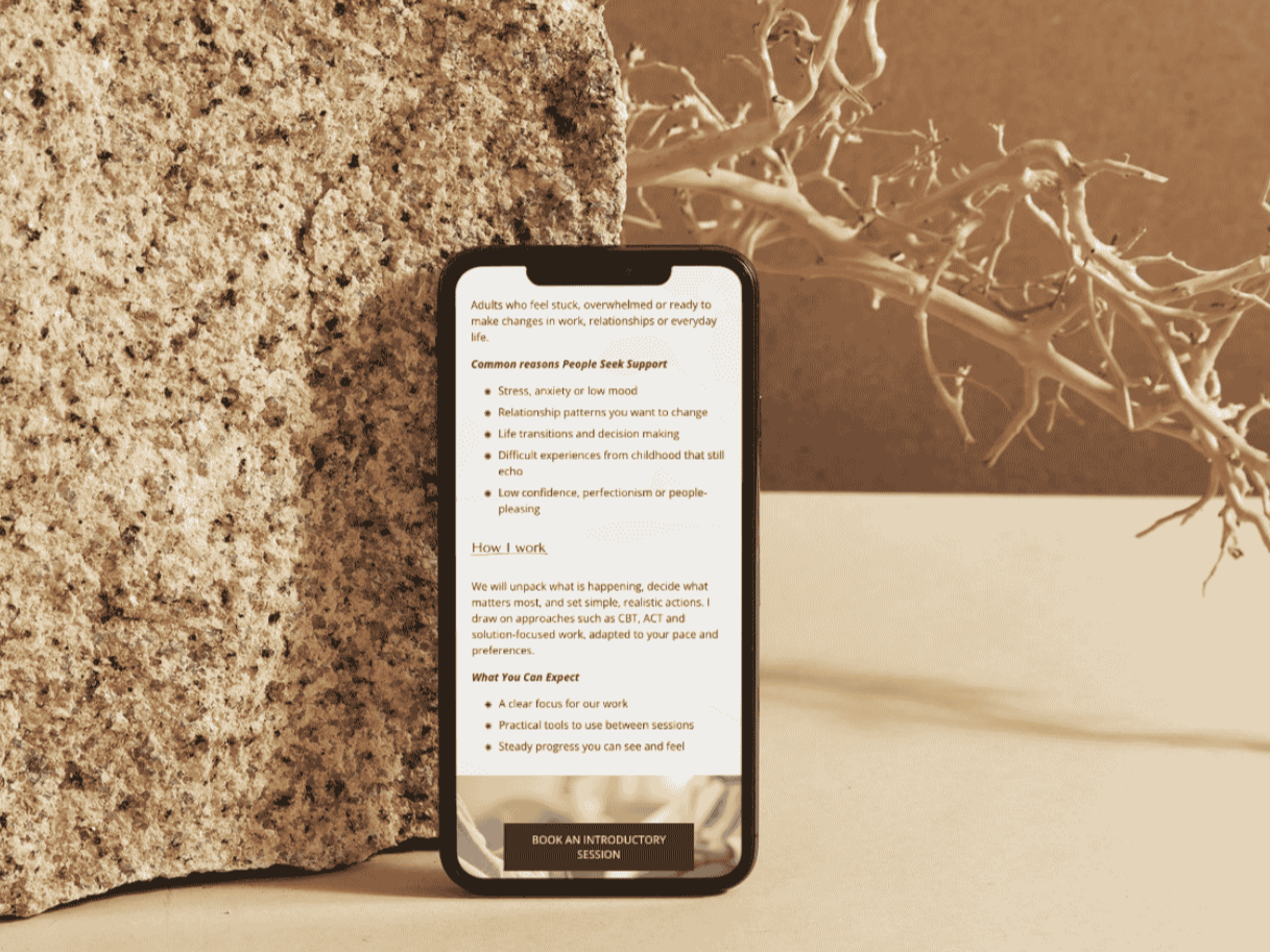
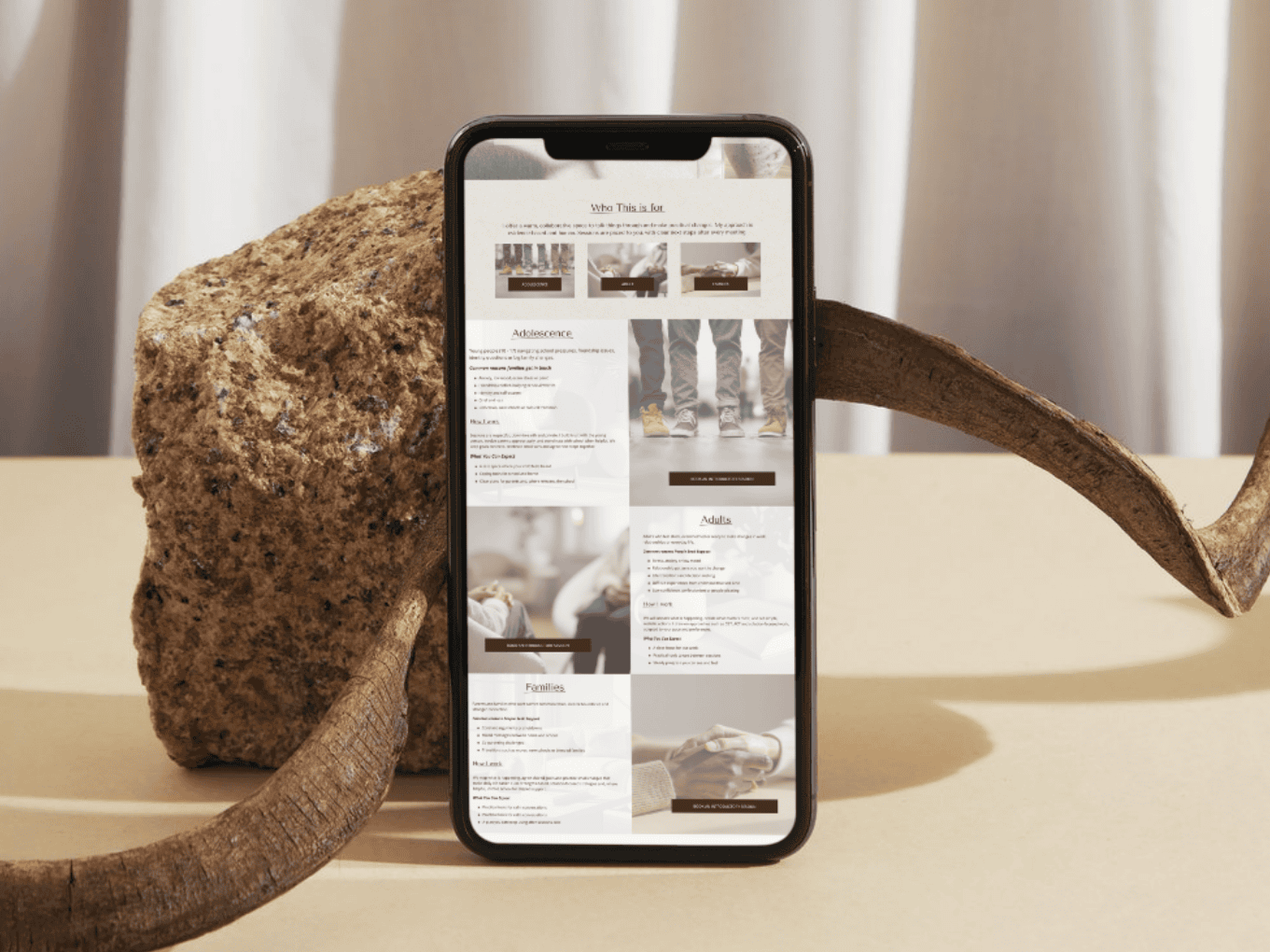
From there, we worked through site structure and user experience, mapping four distinct client types and designing a clear navigation system so each audience had an intuitive path through the site. Wireframes were developed to test hierarchy, flow, and content placement before moving into design.
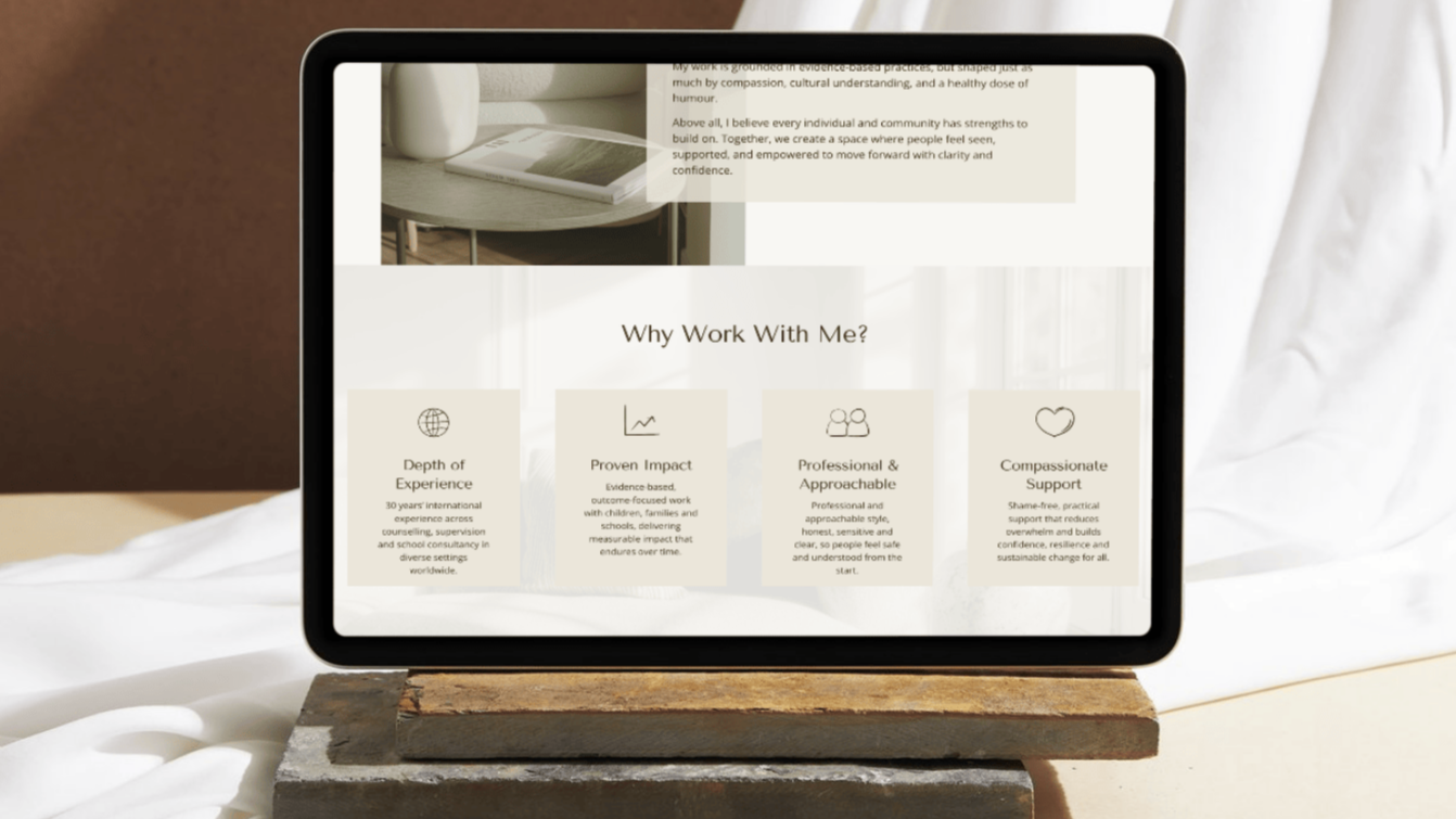
I supported Beth with copy placement and content structure to ensure her expertise was communicated clearly and accessibly, without unnecessary density. Accessibility and user journey were key considerations throughout, particularly given the nature of the work.
The website was built with mobile-first responsiveness, SEO foundations, image optimisation, and a clear booking and contact system. I also collaborated with Beth’s brand photographer to advise on styling and image use, ensuring visual consistency across the site.

The result is a calm, structured website that reflects the depth and professionalism of Beth’s work, while making it easy for different clients to find relevant information and take the next step. The site now provides a clear point of reference for her practice and supports confident, informed enquiries.